How to trick with CSS Grid | A Comprehensive guide
Full stack web developer, work on MERN stack technology. Blogger Tech enthusiast
Introduction
Making website layout is always been challenging for web developers. We all started making page layouts, followed by table-based layouts and float-based layout. In floats based layout system, clear-fix is very confusing for most of the developers. Then we got css flexbox, which was good comparatively than floats. But still it has some drawbacks as it is one-dimensional and it is good when you have list of items and you want to align, justify and arranged as such. One more drawbacks I read on google is performance issues. It can increase the page loading time on larger projects. So, by keeping in mind the above drawbacks and issues, Cascading Style Sheet introducess Grid based layout. The first comprehensive working draft of CSS-Grid was proposed in April 2011 by Phill Cupp at Microsoft.
CSS Grid is a two dimensional grid based layout system making easy to create page layout using rows and columns without having use of float and position. It is more robust and flexible than floats and flexbox. It is mostly used when we have to create complex grid layout. Without any further introductory things lets start with the tutorial.
Pre-requisite
Before you read this article, you should have the basic understanding of grid system using float based and flex-box based in CSS.
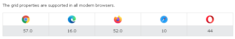
Browser Support
As of wikipedia and w3schools report CSS grid supports all modern browsers. like Chrome, Safari, Firefox, Opera, Microsoft Edge etc.
Basic Terminologies of CSS-Grid
Before we deep dive into the css-grid tutorial we need to know the terminology used in grid-based layout system.
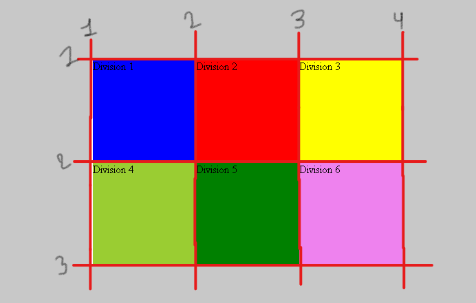
- Grid-Lines : Grid lines are the horizontal and vertical lines that form the basic structure of grid. It starts with the index 1 as you can see in the image below.
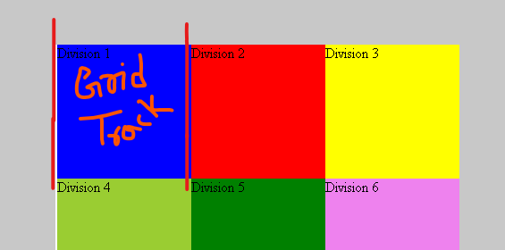
- Grid-track: Grid track is the space between two lines, either horizontally or vertically. It is bounded with two lines as you can see in the image below.
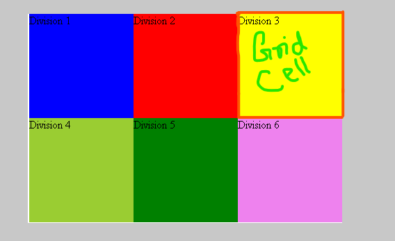
- Grid-cell: Grid cell is space betwwen two adjacent grid-column lines and two adjacent grid-rows lines. Grid cell is also called grid item bounded with four lines as you can see in the image below.
- Grid areas : Grid area can be a grid-cell / grid-items or combination of two or more than two grid items.
- Grid-gap: Grid gap is the space between two grid items or grid-cell. It is achieved using grid-gap property in container element. Below is the image to understand it clear.
Grid Container
Grid container is the parent element of the grid-items. To make the container grid-based layout system we have properties named as display:grid;. Before we create a grid layout lets learn about the css properties and its value.
CSS Grid Container Properties and its Values
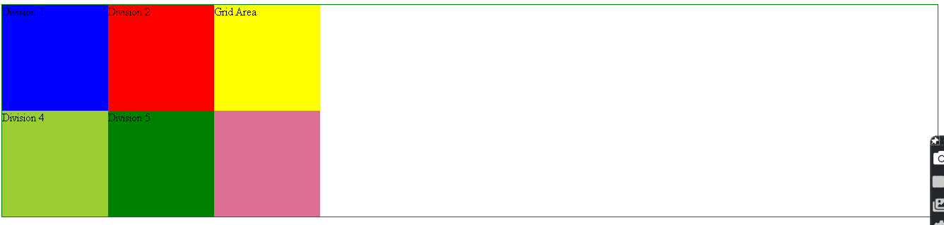
- grid-template-columns :- : This property is used to define the number of columns as well as size of columns. The size can either be of fixed size or variable size. To make the column variable size we have fractional unit system in CSS grid. Below image has 3 columns and fixed size.
The above result can be achieved using, the property
.container {
  display:grid;
  border: 1px solid green;
  grid-template-columns: 150px 150px 150px;
  grid-template-rows: 150px 150px;
}
To make the grid-items responsive size horizontally use fr unit and it occupies all the space in the container.

The above result can be achieved using, the property
.container {
  display:grid;
  border: 1px solid green;
  grid-template-columns: 1fr 1fr 1fr;
  grid-template-rows: 150px 150px;
}
Note: To make the rows responsive size,use fractional unit fr. The above image has equal size column, to variablize the column ratio change the fr unit value.
- grid-template-rows :- : This property is used to define the number and size of rows. Unit system is same as above.
Note: As you have seen we are writing 1fr multiple times, what if we have 10 or 12 columns, writing 1fr or 150px is not a good practice. To deal with this situation CSS grid provide us a function named repeat('the number of cols or rows', 'unit size' )
For example
.container {
  display:grid;
  border: 1px solid green;
  grid-template-columns: repeat(3 , 1fr);
  grid-template-rows: repeat(2 , 150px);
}
- grid-template :- : This property is a short-hand property of grid-template-columns , grid-template-rows and grid-template-areas. This can be written as grid-template-rows/ grid-template-columns.
For example,
.container {
  margin: 50px;
  display:grid;
  border: 1px solid green;
  grid-template: repeat(2,150px)/repeat(3,1fr);
}
Note:- Grid-Container has two more property, that you should know grid-auto-rows and grid-auto-columns* which is used for the implicit grid. Implicit and Explicit grid is defined below in the article.
- grid-column-gap :- : This property is used to define the gap between columns.
For example,
grid-column-gap: 20px;
- grid-row-gap :- : This property is used to define the gap between rows.
For example,
grid-row-gap: 20px;
- grid-gap :- : This is the short-hand property of grid-column-gap and grid-row-gap. The syntax of writing grid-gap is,
grid-gap: 20px;
Note: grid-column-gap , grid-row-gap and grid-gap is the older version, instead of this you can use column-gap , row-gap and gap.
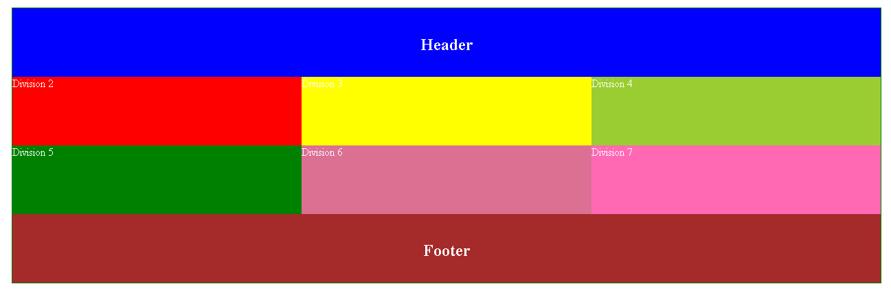
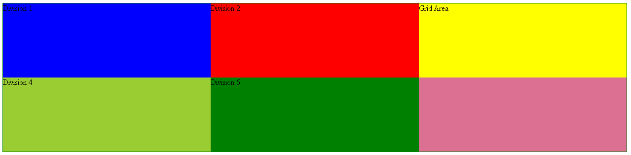
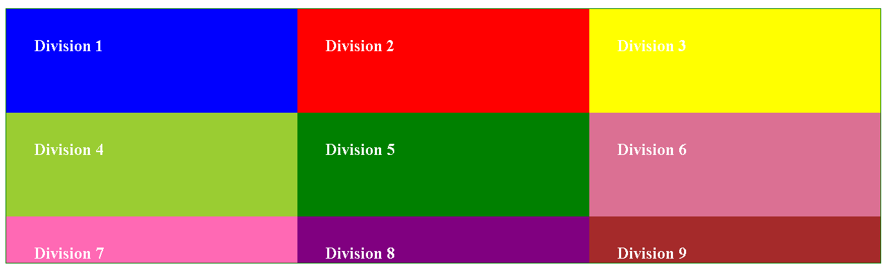
- grid-template-areas :- This property is used to define the grdi-areas within the page layout. As defined above grid-area can a grid-item or combination of multiple grid-items. To achieve template area in page layout we need to define the grid area name using grid-area : nameOfGridArea. To understand this properly, lets take and example,
Suppose you want to define the header area and footer area then it can be written as
.container {
  margin: 50px;
  display: grid;
  color: white;
  border: 1px solid green;
  grid-template-areas: 'header header header'
                        '. . .'
                        '. . .'
                        'footer footer footer';
}
and its child elements will have property,
.div1 {
  background-color: blue;
  grid-area: header;
}
.div8 {
  background-color: brown;
  grid-area: footer;
}
The result of this will be,
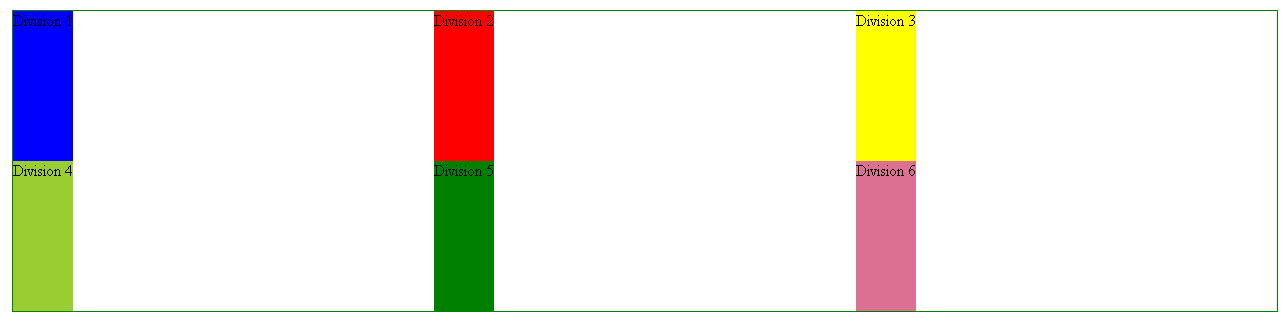
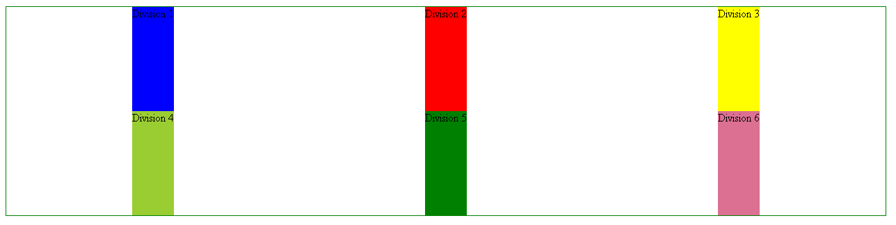
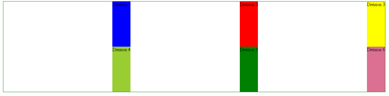
justify-items :- this property is used to assign the grid-items horizontally. It has four property start, stretch which is by default, end and center. Look at the below images for difference between them.
justify-items : start, In this value all the explicit columns assign itself at start position horizontally.
- justify-items : center, In this value all the explicit columns assign itself at center position horizontally.
- justify-items : end, In this value all the explicit columns assign itself at end position horizontally.
- justify-items : stretch, explicit columns fill the container on the basis of given size.
align-items: this property is used to assign the grid-items vertically. It also has four property start, stretch which is by default, end and center. Look at the below images for difference between them.
align-items : start, In this value all the explicit rows assign itself at start position vertically.
- align-items : center, In this value all the explicit rows assign itself at center position vertically.
- align-items : end, In this value all the explicit rows assign itself at end position vertically
- align-items : stretch, Columns fill the container on the basis of given size.
Grid Item or Child Element
Grid item is the individual grid-cell bounded by four side with two adjacent column lines and two adjacent row lines. Grid child element also have many property that is explained below with examples.
CSS Grid Children Properties and its Value
- grid-column-start :- ,
- grid-column-end :- These properties of css are used to define the number of columns to be taken by a grid-item. CSS grid takes line number as its value.
As we have seen above that the line number is always greater than 1 by number of columns and rows.
So if you want to expand the grid-items by 3 column, then we have to write ,
 grid-column-start: 1;
 grid-column-end: 4;
- grid-column :- This is the short-hand property of grid-column-start and grid-column-end and this can be written as grid-column : startValue / endValue .
grid-column: 1/4;
Note :- To make a grid-items or children element full width we can write it as
grid-column: 1/-1;

//We don't need to pass the line numbers
- grid-row-start :- ,
- grid-row-end:- These properties of css are used to define the number of columns to be taken by a grid-item. CSS grid takes line number as its value.
So if you want to expand the grid-items by 3 row, then we have to write ,
 grid-row-start: 1;
 grid-row-end: 4;
- grid-row:- This is the short-hand property of grid-row-start and grid-row-end and this can be written as grid-row: startValue / endValue .
grid-row: 1/4;
grid-area :- This property has been used in grid-template-areas of grid container . It is used to define the grid area name.
justify-self :- This is same as justify-items and have same values start , center , end , stretch. The only difference is it is used in child element.
align-self :- This is also same as align-items and have same values start , center , end , stretch. The only difference is it is used in child element.
Note :- We have been using grid-lines to expand the rows and columns of grid items. In css grid we have span property to span rows and columns. Suppose you want to span three columns or rows, instead of passing line number, It can be written as
grid-column: 1/span 3;
//Now we don't need to pass the line number
Implicit and Explicit Grid
Explicit Grid :- Explicit grid is the grid items that has been explicitly defined in the grid container using the properties grid-template-rows , grid-template-columns , and grid-template-areas. This manually defined grid is called the explicit grid.
Implicit Grid :- Implicit grid is the grid items, that is not been defined by the grid container and it takes auto properties. For implicit grid the most used properties in container element are grid-auto-rows and grid-auto-columns.
Resizing and Repositioning of Grid Items
To resize and repositioning of grid items we have many properties like grid-row-start, grid-row-end, grid-column-start, grid-column-end etc.
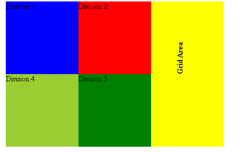
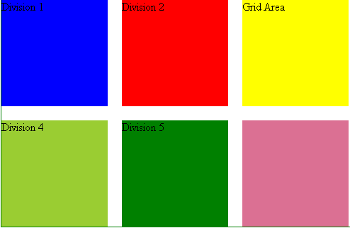
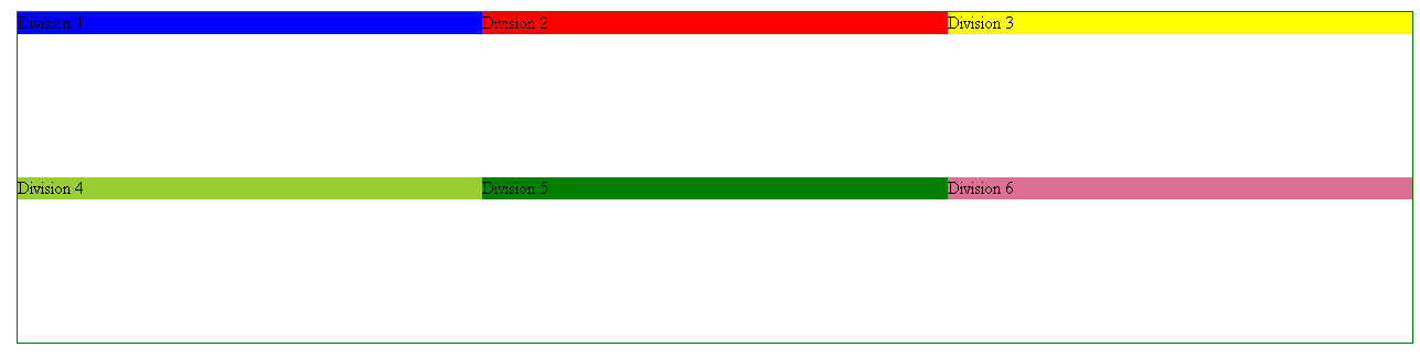
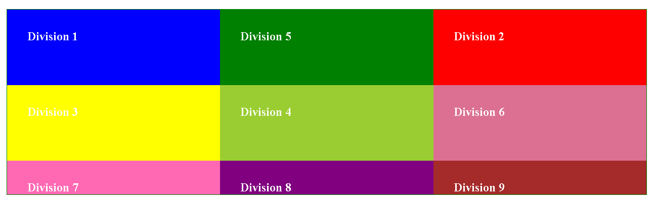
Suppose we have a grid container below and its items are at its original position and we want to palce the Division 5 element at Division 2, This can be achieved as,
Original Position
Code for changing position
.div5 {
  background-color: green;
  grid-column-start: 2;
  grid-column-end: 3;
  grid-row-start: 1;
  grid-row-end: 2;
}
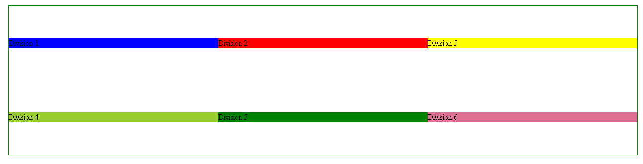
Changed Position of Div 5
Fluid Property of CSS Grid
Fluid property of css grid makes the grid layout responsive without writing @medaiqueries. Some of the properties are as follows:-
- fr unit :- Its an acronym of fractional unit. It solve the width problem of grid items in layout. Using fractional unit we have the ability to define how many columns and rows we want and changes it according to reponsiveness of the layout.
repeat() :- * Repeat function is used when we have multiple columns and rows to define. It is written as repeat(no. of rows orcolumns , fractional unit ). It will always have the specified number of columns no matter how much layout is squished. So, it might create problems on smaller screen. To overcome this we have minmax function.
minmax() :- Minmax function is used to define the minimum length of column and. In this we need to specify the minimum width of th column. It can be written as repeat(no. of rows orcolumns , minmax(minimum-width, fractional unit ).
Minmax function will cause overflow in the row as we are telling explicitly the row has to be specified column. Now to overcome this we have another property named as auto-fit or auto-fill. You can use any of them. It is written as repeat(auto-fit or auto-fill , minmax(minimum-width, fractional unit ).
The difference between auto-fill and auto-fit is, auto-fill will allows more items to be placed in the columns if there are space left but auto-fit will cover all the width of the layout.
Summarizing Up.
In this article I have tried to explain each and evry topic in details. I hope it will help you to grasp the concept of css grid.
